I REMEMBER being taught about countries and their capitals in geography lessons. We all had an atlas and were told to use it. Are countries and capitals still in today’s geography curriculum? Probably pushed out by climate change of course, who caused it (the UK) and what everybody should be doing about it. Is that why no one seems to know where anywhere is?
The broadcast media are no help. Look at this from the January 20 BBC evening news. The Chagos Islands were right there in the headlines. President Trump had just said (again) that we were stupid to give them up. (The first time he described it as an ‘act of great stupidity’ was last May.)
The map the BBC produced in response hardly demonstrates why Diego Garcia ‘is strategically significant due to its role as a vital staging and vantage post . . . [and] is in close proximity [sic] to major international sea lanes in the Indian Ocean’.
This is it. Utterly meaningless.
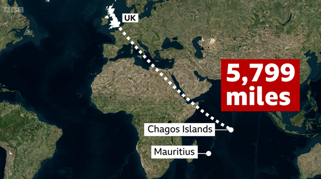
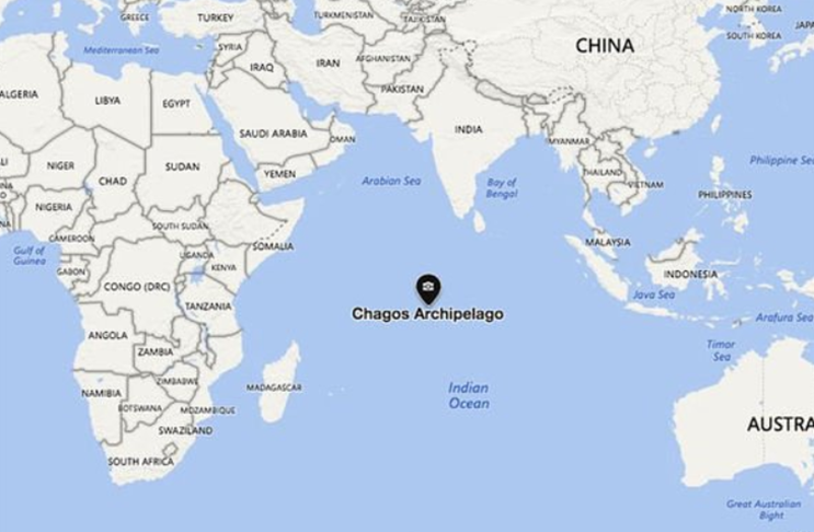
The only useful map is one that shows the Indian Ocean and all the surrounding countries. This is what they should have shown us. (Thank you Daily Express.)
Trump has also dragged Greenland into top place on the world’s worry list. Again, I would consider a map necessary to understand his concern. But not like this one.
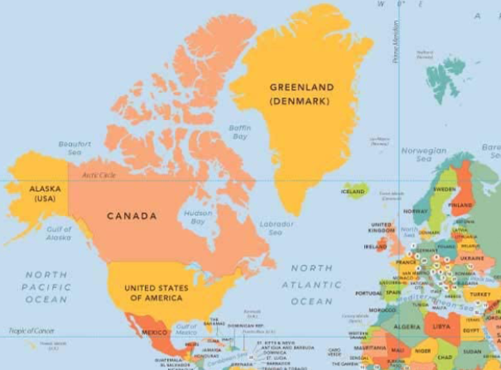
This map is projecting a globe on to a flat surface, and it doesn’t work. Greenland isn’t really more than twice as big as the United States, it’s actually about one quarter the size.
A much better way to show reality is like this, looking down on the northern hemisphere:
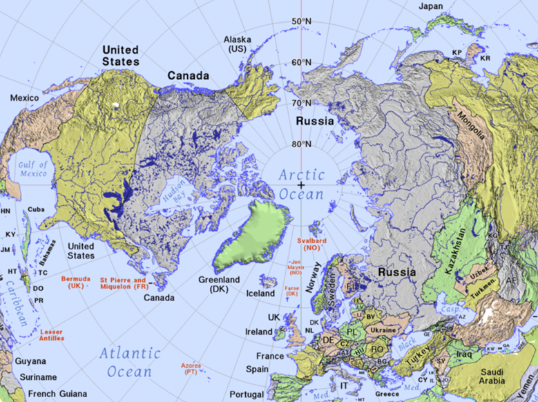
Greenland has not only ‘shrunk’ more to its proportionate size, but you can see how on this map it stands between Russia and the United States. Any of you who have flown from Heathrow to San Francisco, and were awake to look out of the window, might have wondered why you were so far north over Greenland then Hudson Bay. There are other, even better maps of the Arctic Circle and Greenland’s (strategic) position, like the one published by the Epoch Times on Thursday, not by a UK outlet.
Now to Ukraine which has unaccountably fallen out of the news this week despite Mayor Vitaly Klitschko’s rare warning to residents to leave Kyiv if they can amid Russian strikes on the energy infrastructure.
This map, while with some useful detail, still does not give us the whole picture.
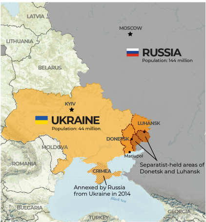
Ukraine is 800 miles long from east to west, and is bigger than any European country, but you wouldn’t know it from that map, would you?
Maps cannot only lack information. They can be startling deceptive. Take this of the Gaza Strip.
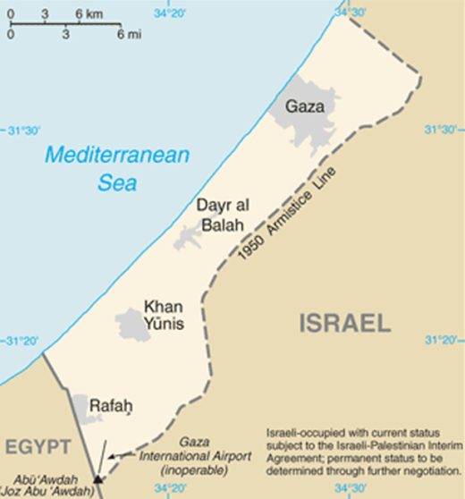
Notice the scale. Did you realise it is only 25 miles long, 7½ miles wide, is smaller than the English county of Rutland, or that it covers the same area as the city of Las Vegas?
Finally, a map that shows a typical 21st century dumbed-down way of explaining where the action is, without the confusing details that might make us worried. This was featured on the BBC evening news, 1st April 2025.
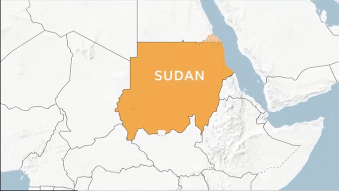
From top left clockwise: Algeria, Libya, Egypt, Saudi-Arabia, Oman, Yemen, Eritrea, Djibouti, Somalia, Ethiopia, Kenya, Sout Sudan, Uganda, Democratic Republic of the Congo, Central African Republic, Cameroon, Nigeria, Chad, Niger.
Wouldn’t it have helped to have all those countries named?
Where are the shouts of protest from our geographers? Or are they all too busy warning us about our climate doom?