ONE AND a half degrees Celsius. In everyday weather this is an imperceptible difference. Yet it is being used to carry a doom-laden message about the world’s future.
You’ve all seen the warnings: if we let the global average temperature rise more than one degree and a half above the pre-industrial (1850-1900) level, we are in for unprecedented heat and storms. My New Year resolution was to answer two questions: Where did that figure come from? And is it really that critical?
We’ll start with the global average temperatures for the last three years.
2022 was 1.16°C above pre-industrial levels (1850-1900)
2023 was 1.46 C above
2024 was 1.53 C above
(Met Office data)
The implied accuracy of hundredths of a degree is an example of bad science trying to look good. It is bad science in several ways, as we shall see.
The first United Nations Framework Convention on Climate Change (UNFCCC) document to mention limiting global warming to 1.5°C was the Cancun Agreement, adopted at COP16 in 2010. The Paris Agreement (COP21, December 2015) reinforced this decision and it was to be compared with ‘pre-industrial’ levels, which later became the period 1850-1900.
Nothing wrong with that, you may be thinking. These people were worried the world was warming and saw a need to monitor the extent and rate of the rise. Very scientific.
But the quoted super-accurate temperature data generate increasingly urgent calls for widespread abandonment of anything remotely carbon based, which includes most of the world’s current electricity generating capacity along with everything else using gas, coal or oil. ‘Breaches of 1.5°C for a month or a year,’ says the United Nations, ‘areearly signs of getting perilously close to exceeding the long-term limit, and serve as clarion calls forincreasing ambition and accelerating action.’
A degree and a half is a very small foundation on which to mount calls for possibly devastating changes to the economies of the world. That same United Nations quote explained that the period 1850-1900 had been chosen for the baseline as it was ‘the earliest period for which high-quality observations of surface temperatures over the land and ocean are available’. High-quality observations?
A report from the UN International Panel on Climate Change (IPCC) claimed that ‘The period 1850–1900 represents the earliest period of sufficiently globally complete observations to estimate global surface temperature.’ Globally complete?
The first clue that all is not quite what it seems to be came from Nasa early last year. ‘Earth’s average surface temperature in 2023,’ they announced, ‘was the warmest . . . since recordkeeping began in 1880.’ 1880?
Artificial Intelligence is now being used to give us the answer to everything. (But see Benedict Bird’s very worrying piece on this page recently). ChatGBT, for instance, says: ‘The confidence level of pre-industrial global temperatures is generally considered medium to low, due to limitations in the available data . . . Estimates rely on proxies such as tree rings, ice cores, sediment layers, and coral growth. Proxy data have inherent uncertainties due to their indirect relationship to temperature.’ Proxy data?
‘Even in the 1850-1900 period,’ said a BBC article quoting from a Nature report, ‘there were only 58 weather stations recording temperatures around the world, with 45 of them in Europe.’ 58?
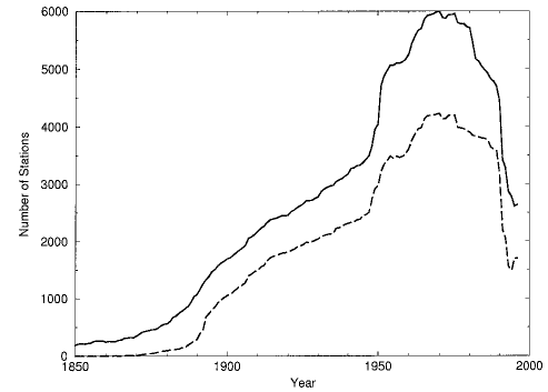
How many temperature reporting stations were there really in the world in that 50-year period? Dig deep enough and the information is available, unsurprising, and hardly supportive of some of the comments above. The National Oceanic and Atmospheric Administration (NOAA) and other US organisations have been constructing a Global Historical Climatology Network Temperature Database. Their website has this very interesting graph showing the actual number of reporting stations from 1850. Solid line: Mean temperature. Dashed line: Max and min.

Notice the 1850-1900 section. Interesting?
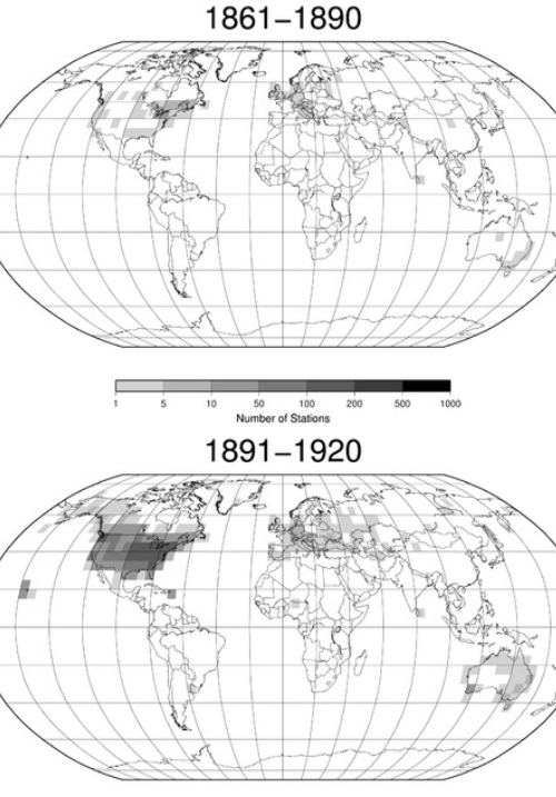
But there’s some even more useful information from research published in an American scientific journal: two maps showing the distribution of recording stations from 1861-90 and 1891-1920.

It is clear that there were nothing like sufficient places recording temperatures in the critical period 1850-1900. Something like 70 per cent of the land surface and possibly 98 per cent of the oceans had little or no data even by 1920.
The global average temperature of the period 1850-1900 is taken as the base from which to judge by how much and how quickly the world’s temperature is rising. The comparison each year is the very foundation of the global warming message.
That information is deliberately constructed to impress us with its accuracy and confidence: always given to two places of decimals, but temperatures throughout the world are measured in tenths of a degree, and always have been. The implication is that they know the global average over the years 1850-1900 to within hundredths of a degree. Look at those maps again. Is that really possible?
This is bad science because it is not soundly based on widespread quality-controlled data. It is bad science because it implies an accuracy it does not warrant. It is bad science because the 50-yr pre-industrial time period was selected before checking to see whether there was sufficient information available to justify the choice.
It is bad science because of the doom-laden message about the world’s future being derived from differences of a few hundredths of a degree taken from very questionable basic data.


