THERE is a move afoot in the western world which will permanently prevent anyone from having a new idea. It has been tried many times before, mostly successfully. It has been seen operating under the control of common-or-garden varieties of dictators, who proudly boast that 97 per cent of the population loves and agrees with them. This latest version is being disguised as a fully justifiable attempt to protect citizens from harm, the harm that comes from the viral spread of that enchantress Miss Disinformation.
One could ask: ‘What is wrong with stopping the flow of misinformation?’ The reply might be ‘nothing’, as long as the guardian spirits are 100 per cent correct, as they claim to be, in their assessment of the degree of error they are protecting citizens from. Such certainty is difficult to achieve and different techniques are used to bypass this requirement. The simplest is to prepare the ground before the fight has begun by softening up the ‘citizens’, frightening them with so-called facts. To make sure of success, terminology is bowdlerised to the extent that, ‘Yes doesn’t mean Yes’, and ‘No doesn’t mean No’. Easily achieved by mixing not metaphors, but scales, by deliberately comparing apples and oranges, and calling anyone who notices the sleight of hand a ‘denier’ of the science.
Remember that Copernicus, Galileo, Darwin, Einstein and a multitude of serious thinkers, whose brilliance brought us the Industrial Revolution and its burgeoning global GDP, were mocked as ‘deniers’, so let’s revel in their company.
I have previously noted the IPCC’s confusing preference for two different units of parts per million (ppm) and millions of tons (mt), when discussing CO2, and suspect, perhaps unfairly, that their reasons for doing so were a) to obfuscate or confuse and b) to frighten. Emissions of 7,800mt sounds a much weightier problem than emissions of 1ppm. New Zealand’s 30mt of emissions in 2022 may sound large to uninformed law makers bent on setting an example to the world, but is 0.4 per cent of 1ppm a real threat to the world’s climate?
Other examples of clearly obfuscating terminology can be found in the changes in IPCC’s language usage over time, from ‘global warming’ during most of the last century, a term which has units of temperature that can be measured, to ‘climate change’ during much of this century, with no measurable units, and now to ‘boiling’, which occurs only at 100OC, or otherwise in the mind of the UN Secretary General.
To ‘prove’ that CO2 is a pollutant, the IPCC and its acolytes regularly flash pictures of cooling towers in an attempt to make the people believe that the white stuff exiting from the top is CO2, when in reality it is condensing water vapour/steam! Yet another obfuscation? It seems that they are so unsure of their science, they have to rely on innuendo, not real data.
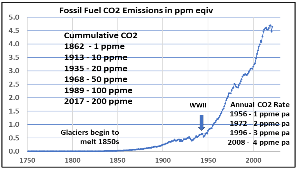
A more sinister deception is buried in the claim that global warming all started with the Industrial Revolution, which the data on CO2 production since that time shows to be untrue. Alpine glaciers had started to melt around 1825, yet cumulative emissions from all fossil fuel burned up to 1862 was just 1ppm, and these emissions had reached only 10 ppm by 1913, some 60 years later. Emissions did start to increase significantly following WWII, when the annual rate of emissions reached just 1ppm. Rates then did accelerate and reached 4 ppm per year some 50 years later in 2008.
Fig 1 Changes in Annual Fossil Fuel CO2 from 1965 – 2021 (1)

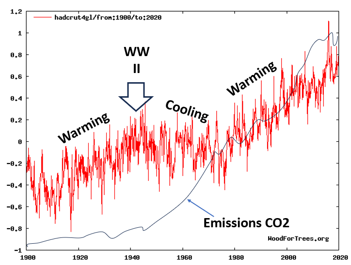
Almost half of the total warming that the world has experienced since the Industrial Revolution began occurred just before the end of WWII in 1943, and clearly could not be due to the vanishingly small emissions prior to that date. There is therefore no evidence of a causal link between the low rates of emissions before WWII and the strong warming that occurred between 1910 and 1943. It is also odd that as emissions began to climb, the world began to cool, leading to forecasters (climate science had not been invented then) predicting a new Ice Age, with the Statue of Liberty covered in ice.
Fig 2: Global Temperature Changes with digitised CO2 from 1900 – 2020 (2)

The story continues up to the present time with a complete lack of correlation between emissions, atmospheric concentrations of C02 and ‘global warming’ or ‘climate change’, but they do increase the earth’s fertility, and thus may not need cancelling.
The increase in global crop productivity is due in part to CO2 and also to the use of artificial fertilisers produced from fossil fuels. What happens when artificial fertilisers are banned by green politicians can be seen in the collapse in rice production in Sri Lanka, when the government mandated organic farming practices supported by only natural fertilisers. Unfortunately, natural nitrogen fertiliser relies on an adequate supply of cow dung, and without it, Sri Lankans starved as a previous exporter of rice became an importer.
The number of humans living in poverty has fallen below one billion for the first time, even though the global population has increased dramatically; all thanks to the benefits brought by the glorious Industrial Revolution. Cutting emissions would reverse this trend and increase poverty and starvation.
Fig 3: Fall in numbers of people living in poverty

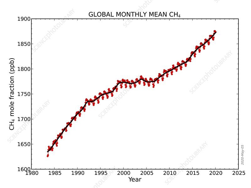
But it is not only CO2 that gets this type of treatment, CH4 or methane, is another greenhouse gas which has its role artificially magnified and distorted as with a fairground mirror exhibition. Methane is reportedly 28 times stronger than CO2 as a GHG, and increased from just under 1,640 parts per billion (ppb) in 1988, to around 1,880ppb by 2020, an increase of 240ppb in 32 years. A significant increase, one might think, but to compare like with like methane increased by only 0.24ppm, compared with the 62.55ppm increase in CO2 of over the same time period; even if it is, as claimed 28 times more active as a GHG than CO2, that equates to just 6.7ppm. On the strength of this ‘science’, it is difficult to understand where the craze for cutting bovine emissions of CH4 came from, and why they want us to eat insects instead?
Fig 4: Monthly Mean Methane, CH4

Graph showing global-averaged monthly mean atmospheric methane (CH4) levels as determined from marine surface sites since 1983. The levels are given as a dry air mole fraction, which is the number of methane molecules divided by the total number of molecules in a sample after water vapour has been removed. Methane is a powerful greenhouse gas. It is produced by modern agricultural practices and the decomposition of organic matter. The red lines and circles are globally averaged monthly mean values centered on the middle of each month. The black line and squares show the long-term trend (similar to a 12-month running mean) where the average seasonal cycle has been removed.
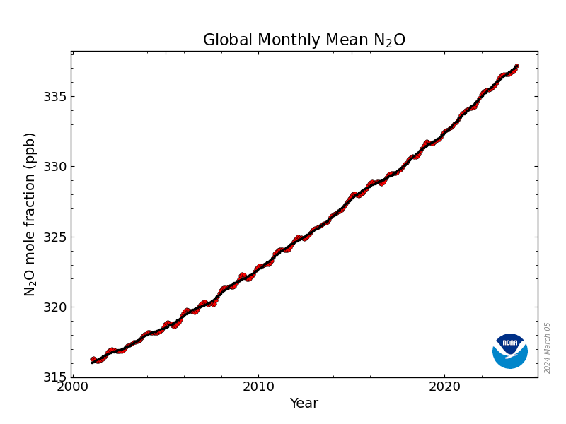
As with the other GHGs, except perhaps H20, global concentrations of Nitrous Oxide, N20, are increasing, currently by 1.2ppb per year, rising from 316ppb in 2001 to 337ppb in 2024; that is 21ppb or 0.021ppm in 23 years. How can this be a significant number?
Most of the N20 has an agricultural origin, through the application of nitrogen fertiliser, whether derived from fossil fuels (gas) or naturally by methane-belching ruminants. It is however, some 265 times stronger GHG than CO2 so, if we convert ppb to ppm CO2 equivalent, we find that 1ppb would be equal to 2.65ppm increase in CO2 terms.
Fig 5: Global Nitrous Oxide N2O

Then there is the urge to measure human emissions by the utterly useless yardstick of ‘per capita’ emission, which defines how much each person in a particular country emits, by dividing those emissions in tons or ppm by the population. This number juggling allows them to say that Australia, with a population of 27million and emissions of 350 mt, or 12.9 mt per person, is a worse polluter than China, where 1.4billion people in 2022 generated 10,550 mt, or 7.1 mt per person. Even if CO2 does cause global warming, the atmosphere doesn’t care where or by whom the gas was produced, but it helps to make people in the west feel guilty.
What we see in all of this sleight of hand and obfuscation is the deliberate and utterly unscientific inflation of some very small numbers, either in ignorance, stupidity or to frighten people into believing the threat of catastrophic climate change that the unadjusted data does not support. Surely not?
References
(1) CDIAC
(2) Wood For Trees temp data plus hand digitised CO2 from Fig 1

